Method 1: Use of Plugin
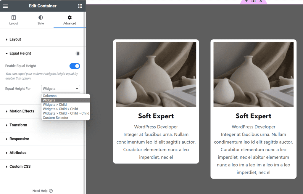
There is a free addons plugin for Elementor, using which we can make the boxes equal in height.
- Download the plugin here.
- Upload and activate the plugin in the WordPress dashboard.
- Make sure to turn on ‘Equal height’ widget in the plugin settings.
- Then edit any page with elementor, and you will see the equal height option for all widgets.

Method 2: Custom CSS
The CSS line-clamp property is a handy tool that allows you to limit the number of lines shown from an element, effectively truncating text. It’s often used in conjunction with display: -webkit-box; and -webkit-box-orient: vertical to work properly as it originated from the Webkit browser engine. Remember, since this is a non-standard property, it mainly works with browsers based on Webkit and Blink, like Safari and Chrome.
CSS line-clamp enables sleek management of overflowing text by limiting visible lines in your web designs! This guide will swiftly elevate your UI creation skills, whether you’re a beginner or intermediate. Dive in to master text truncation with line-clamp and boost your designs!
.classname {
  display: -webkit-box;
  -webkit-line-clamp: 3; /* Display 3 lines */
  -webkit-box-orient: vertical;
  overflow: hidden;
}
Responsiveness
To control the layout on different devices like mobile and tablet, we can use CSS media query. See example below:
.classname {
  display: -webkit-box;
  -webkit-line-clamp: 5; /* Display 5 lines by default */
  -webkit-box-orient: vertical;
  overflow: hidden;
}

@media (max-width: 767px) {
  .classname {
    -webkit-line-clamp: 2; /* Display 2 lines on screens narrower than 767px */
  }
}

