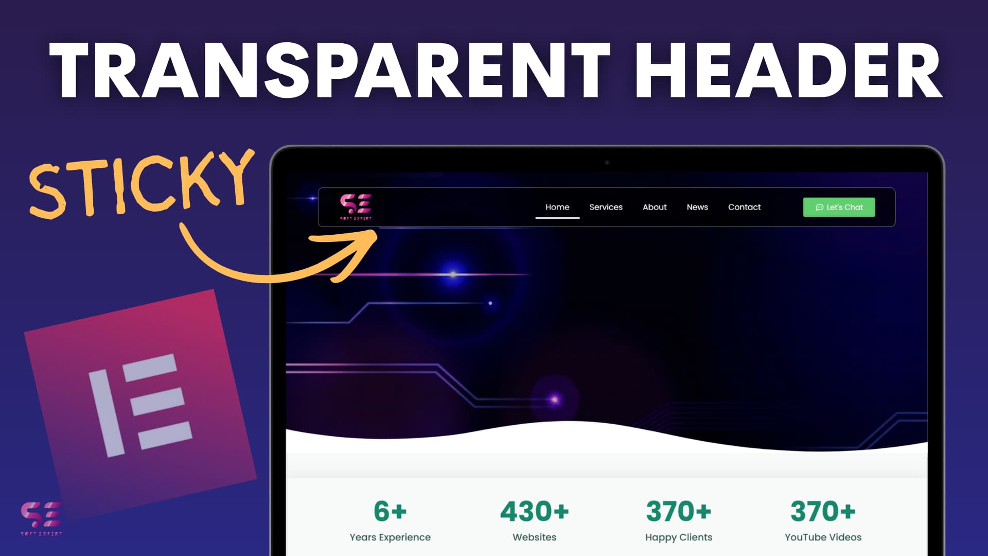
Modern websites often use a transparent header that smoothly transforms into a solid sticky navigation bar as you scroll. This clean effect improves navigation while keeping the hero section visually appealing.
In this tutorial, learn how to build a beautiful scroll-based sticky header animation using Elementor’s Theme Builder — no advanced coding required.
CSS Code:
#headone .head-child{
    border: 1px solid rgba(0,0,0,0.0);
}
#headone.elementor-sticky--effects .head-child {
    background: rgba(0,0,0,0.7) !important;
    backdrop-filter: blur(7px);
    margin-top: 20px;
    border-radius: 10px;
    border: 1px solid rgb(255,255,255,0.6);
    padding-right: 30px;
    padding-left: 30px;
}

#headone.elementor-sticky--effects .head-child .sticky-menu-items ul li a {
    color: fff !important;
}

#headone.elementor-sticky--effects .head-child, #headone.head-child .sticky-menu-items ul li a, #headone .elementor-sticky--effects .head-child .header-logo, #head .head-child {
    transition: .3s all ease-in-out;
}

/* mobile Responsive */

@media (max-width: 767px){
    #headone.elementor-sticky--effects .head-child{
        background: rgba(0,0,0,0.4) !important;
    }

    .elementor-nav-menu--dropdown{
        margin-left: 10px;
        margin-right: 10px;
    }
}
Quick Overview of the Build
- Create Header Template: Go to Templates > Theme Builder > Add New > Header. Use Flexbox containers for a clean layout.
- Header Structure
- Logo (left)
- Navigation Menu (center)
- Call-to-Action Button (right)
- Make it Responsive: Adjust widths, hide/show elements, and style the mobile hamburger menu for tablet and mobile views.
- Add Sticky + Transparent Effect
- Set the main container background to transparent.
- Enable Sticky (Top) in Motion Effects.
- Adjust Effects Offset and Z-index.
- Smooth Scroll Animation: Add a few lines of custom CSS to create a nice transition:
- Background appears with blur
- Rounded corners and padding
- Color changes on scroll
Why This Effect Rocks
- Preserves hero visuals at the top
- Provides easy navigation after scrolling
- Fully responsive and lightweight
- Gives a premium, professional look
This simple yet stunning header animation works great for any WordPress site built with Elementor.
Have you implemented a similar effect? Share your results below!
